
Cabinet color guide
How to Choose Kitchen Cabinet Colors That Work With Your Connecticut Home
Choose cabinet colors that coordinate with your countertops, floors, and lighting—with practical advice for a kitchen that feels like home.
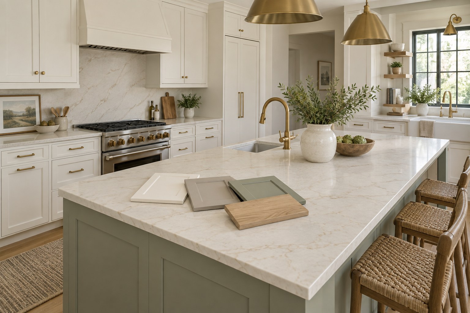
You find a kitchen online that looks perfect. The cabinets are a soft white, the hardware is beautiful, and the whole room feels bright and welcoming. Then you bring a similar paint sample home, hold it against your countertop, and something looks wrong.
The white seems yellow. Your backsplash suddenly looks gray. Even the flooring appears different.
Choosing a cabinet color can be surprisingly complicated because cabinets never stand alone. Countertops, floors, lighting, walls, and nearby woodwork all influence how the finished kitchen will look.
The good news is that you do not need to follow every design trend or replace everything in the room to create a coordinated result. A thoughtful selection process can help you narrow the options and avoid an expensive color mistake.
For Connecticut homeowners planning a cabinet update, the best place to begin is with the kitchen you already have.
Start With the Surfaces You Plan to Keep
Before looking through paint colors, decide which elements are staying.
Your countertops, flooring, and backsplash usually deserve the most attention because they occupy substantial space and sit directly beside the cabinets. Existing trim, appliances, and adjacent rooms also matter.
Make a short inventory:
- What color is the countertop background?
- Does the stone or quartz include warm or cool veining?
- Is the flooring golden, reddish, gray, or neutral?
- Does the backsplash have a noticeable undertone?
- Will the existing wall color and trim remain?
Try to describe what you actually see rather than using broad labels. “White countertop” is less helpful than “soft white countertop with gold and beige veining.”
For example, a warm countertop may coordinate more comfortably with a soft neutral cabinet color than with a stark, cool white. That is a starting point for testing, not a rule that applies to every room.
If you plan to replace the countertop soon, choose the new surface before finalizing the cabinet finish. Otherwise, you may limit your future options around a color selected for something you intended to remove.
Understand Why Undertones Matter
An undertone is the subtle color influence beneath a surface’s overall appearance.
Two cabinet samples can both look beige when viewed separately. Place them together, and one may appear pink while the other looks greenish. Whites and grays can show similar differences.
Those relationships become more noticeable when large surfaces meet.
A cabinet color might look balanced beside a plain white sample board but appear unexpectedly cool beside cream-colored tile. Neither material is necessarily unattractive. They simply create a different effect together.
Rather than trying to memorize every possible undertone, compare a small number of candidates directly against the fixed surfaces in your kitchen.
Hold samples beside the backsplash, beneath the countertop edge, and near the floor. Eliminate colors that consistently make the materials you are keeping look less appealing.
The goal is a combination you enjoy seeing together.
What the Latest Cabinet Color Data Actually Tells Us
Trends can provide ideas, but they should not make the decision for you.
According to Houzz’s reporting on its 2026 U.S. Houzz Kitchen Trends Study, wood was the leading cabinet color choice at 29%, narrowly ahead of white at 28%. Medium wood tones accounted for 15%, light wood for 11%, and dark wood for 3%. The study surveyed 1,780 U.S. Houzz users about recent, ongoing, or planned kitchen renovations. 1: Houzz
The useful takeaway is that homeowners are choosing a range of finishes. White remains popular, and visible wood is very much part of current kitchen design.
Those figures do not mean you should strip painted cabinets to expose the wood or cover beautiful wood because another color catches your eye.
Use trend reports to discover possibilities. Use your home’s materials, lighting, and your own preferences to choose among them.
Consider These Cabinet Color Directions
Soft whites and off-whites
A soft white is worth testing if you want a lighter appearance without a strong color statement.
Pay close attention to your countertop and trim. A cabinet white that looks clean beside one surface may make another look dingy or overly yellow.
Avoid assuming that every white in the room needs to match exactly. A deliberate difference can work well. The problem is an almost-match that looks accidental.
Warm neutrals
Beige, taupe, and warm gray can provide a quieter transition between light countertops and wood floors.
These colors are useful candidates when bright white feels too stark. However, warm neutrals still have undertones, and they need the same testing as any other color.
Look at them in shadow as well as direct light. A subtle sample can appear considerably deeper across a full wall of cabinetry.
Muted greens and blues
A subdued green or blue can add personality while leaving room for other materials to stand out.
If you are hesitant about using color everywhere, consider whether an island or a separate cabinet grouping would be a suitable place to introduce it.
Choose the actual shade carefully. A green that looks soft in a photograph may appear much stronger in your kitchen.
Deeper colors
Charcoal, navy, dark green, and rich brown can create a substantial visual presence.
Before committing, think about how much cabinetry the room contains and where shadows fall. A dark sample on one door does not convey the same effect as an entire bank of tall cabinets.
Try a larger mockup or several sample boards to better understand the balance.
Natural wood finishes
If you like the grain and character of your existing cabinets, ask whether a renewed wood finish is practical.
The starting wood species, existing stain, previous repairs, and surface condition influence what is achievable. An inspiration photo showing pale oak does not establish that a different wood can be refinished to look identical.
Request a representative sample before approving a major stain change.
Check Your Kitchen’s Lighting Before Making a Decision
A color selected under store lighting may behave differently at home.
Benjamin Moore’s guidance explains that natural and artificial light, the direction of sunlight, and the time of day all affect how a color appears. The company recommends testing a color in the actual space over several days. 2: Benjamin Moore
For a Connecticut kitchen, do not judge the sample only during a sunny afternoon. Check it during an overcast morning and after sunset, when you are relying on indoor lighting.
Use the lights you normally turn on while cooking and eating. Under-cabinet lighting can make the relationship between cabinets and backsplash look different from the view under ceiling lights alone.
If you intend to change light fixtures or bulbs, address that before the final color approval. Otherwise, you are making a decision under conditions that will soon change.
Use Light Reflectance Value as a Helpful Reference
Paint manufacturers often publish a color’s light reflectance value, or LRV.
Sherwin-Williams explains that the scale runs from 0, representing complete light absorption, to 100, representing complete reflection. Higher values indicate more reflective colors. 3: Sherwin-Williams
LRV can help you compare how light or dark your shortlisted colors are. It does not tell you whether a color will coordinate with your countertop, and it does not replace a physical sample.
A pale cabinet finish also cannot compensate for every lighting problem. If the kitchen lacks adequate illumination where you prepare food, evaluate the lighting itself alongside the color selection.
Think of LRV as one useful piece of information rather than a score that determines the best choice.
Coordinate Cabinets With Wood Floors Without Matching Everything
Wood flooring often causes homeowners the most uncertainty.
Should the cabinets match it? Will painted cabinets look disconnected? Can two different wood tones work together?
Begin by deciding whether you want similarity or contrast.
Trying to closely match an existing wood floor can be difficult because species, grain, finish, age, and lighting all influence appearance. A clearly intentional difference may be easier to achieve.
For example, you might test a soft painted finish against a golden wood floor, or compare a deeper cabinet stain with lighter flooring. Neither combination is automatically right. The actual samples need to work together.
View the samples from the doorway as well as up close. Kitchens are experienced as whole rooms, and a combination that seems busy at arm’s length may feel balanced from a normal viewing distance.
Make Two-Tone Cabinets Feel Intentional
Using two cabinet colors can help define an island or distinguish a separate area, such as a beverage station.
Start with a clear reason for the contrast.
An island already has a physical separation from the perimeter cabinetry, which can make it a natural candidate. Alternating colors across unrelated doors usually creates a more fragmented appearance.
Choose the main cabinet color first, then evaluate the second color with the countertop, flooring, and hardware.
Remember that two-tone does not have to mean two painted colors. A painted perimeter and a wood island may be worth exploring if the materials and construction support your plan.
Keep the rest of the room in mind. If the backsplash and countertop already contain strong patterns, a simpler cabinet palette may give those materials room to stand out.
Approve a Finish Sample, Not Just a Color Name
Once you narrow the choices, ask how the selected color will be produced in the actual cabinet coating.
A paint chip is useful for screening options. Final approval should account for the coating, sheen, and cabinet surface.
Ask to see a representative sample that helps answer practical questions:
- How much wood grain will remain visible?
- What will the sheen look like?
- How does the color appear on a vertical surface?
- Will repaired areas affect the final appearance?
- How will the finish coordinate with exposed cabinet sides and trim?
Photographs and digital renderings can help communicate an idea, but screens should not be the final authority on color.
Keep a record of the approved color, product, sheen, and included surfaces with your project paperwork.
Frequently Asked Questions
What cabinet color works best in a small kitchen?
There is no single best color. Lighter finishes are worth considering when you want a more reflective palette, but layout, lighting, countertops, and contrast also affect the room’s appearance. Test your choices in the actual kitchen before assuming white is the only suitable option.
Are white kitchen cabinets going out of style?
White remains a widely selected option. Houzz’s 2026 study reporting placed it just behind wood among surveyed renovating homeowners. More importantly, a white that coordinates with your home can remain an appealing choice regardless of which finish leads a yearly survey.
Should cabinets match the trim?
They do not have to match, but they should look intentional together. Compare the cabinet sample directly with window and door trim. If the colors are very close, decide whether you want a true match or enough contrast to make the difference clear.
Can I change dark stained cabinets to a light wood finish?
Possibly, but the result depends on the wood, existing stain, construction, and condition. Removing a dark finish does not guarantee a pale, uniform result. Have a professional assess the cabinets and produce a sample before committing to that direction.
Should I choose hardware before the cabinet color?
You can explore them together, but approve the combination before purchasing all the hardware. Place a sample knob or pull against the proposed finish. Consider nearby faucets, lighting, and appliances without assuming every metal must be identical.
How many colors should I sample?
Start with a manageable shortlist, such as three distinctly different candidates. Compare them in several locations and lighting conditions, then narrow the selection. Bringing home dozens of nearly identical samples at once can make the decision harder without providing more useful information.
Choose a Color That Belongs in Your Home
The most successful cabinet color is one you enjoy in your own kitchen, alongside the surfaces and furnishings you plan to keep.
Start with those materials, test under real lighting, and approve a representative finish sample. A little care during selection can prevent the disappointment of discovering an unwanted undertone after every door has been finished.
Elite Valor Wood Works offers cabinet refinishing, refacing, and custom cabinetry in Northern Connecticut. Visit Elite Valor Wood Works to discuss your cabinet project and the appearance you want to achieve.
Bring inspiration photos, but also bring questions about your existing kitchen. Both help turn an appealing idea into a practical plan.
Sources
- Houzz — Wood Cabinets Are the Top Choice for Kitchens: Findings From the 2026 U.S. Houzz Kitchen Trends Study
- Benjamin Moore — How Light Affects Colour
- Sherwin-Williams — Worthy of Reflection: Understanding Light Reflectance Value
- Elite Valor Wood Works — Cabinet Refinishing, Refacing, and Custom Woodworking
Let’s talk about your cabinets.
Discuss your ideas with Elite Valor Wood Works in Northern Connecticut.
Request a Free Estimate